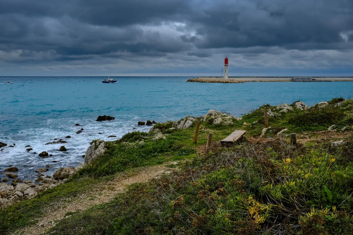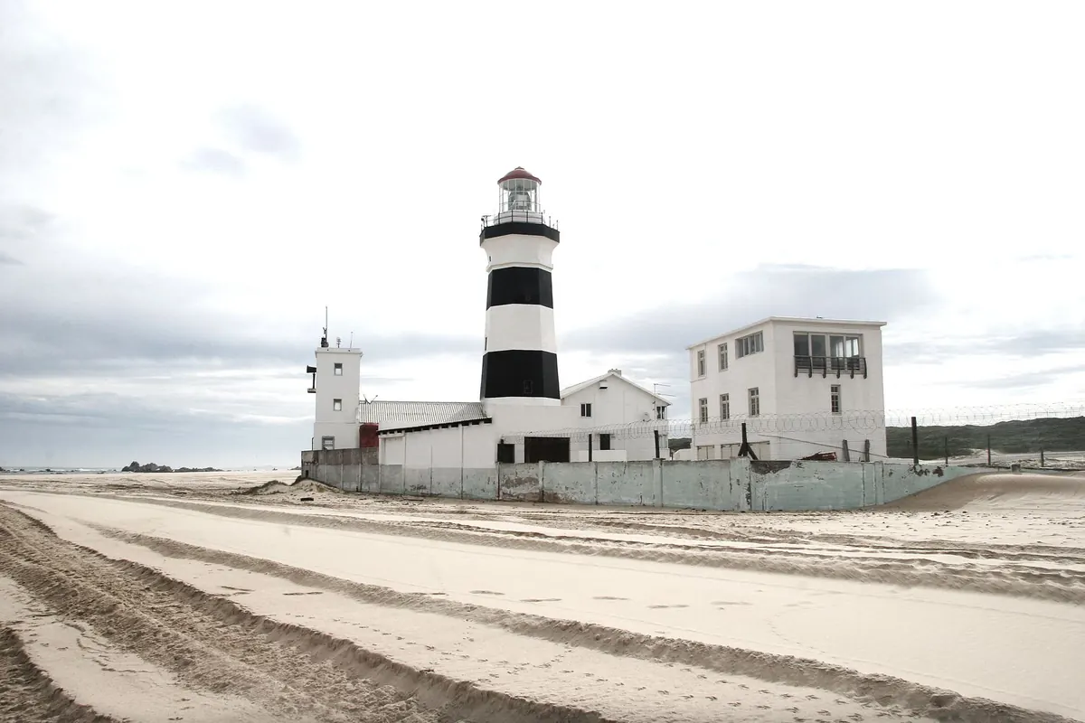
From a cliff path, a striped lighthouse can look almost like a piece of graphic design set down on the coast. The effect is deliberate. Those bands are not there to make the tower charming, though they often do. They answer a practical question: can a mariner see and recognize this structure in daylight, before the lamp has any chance to matter?
The Daymark: Why Paint Matters in Daylight
A lighthouse works hardest at night, but it has a second job during the day. Mariners need to identify the tower, confirm their position and match what they see against a chart. The shape, color and pattern of the structure are all part of its daymark — the visual signature it presents in clear weather.
Paint is one of the simplest ways to create that signature. A plain tower can be handsome and perfectly visible, but visibility is not the same as recognition. A white tower against a pale sky may show only its outline. A dark tower against a dark cliff may disappear into the land. A banded or spiraled tower gives the eye something to catch: a repeated contrast, a clear edge, a pattern that can be described in a sailing direction or remembered from a chart.
Good daymarks are not subtle. A lighthouse does not need to shout, but it does need to be unmistakable. Stripes help because they turn a narrow vertical form into a series of strong visual blocks. At a distance, the eye can lose a thin tower against a busy horizon. It is much less likely to lose a tower that reads as black, white, black, white.
How Stripe Patterns Solve Different Problems
The first problem is contrast. Alternating bands create edges where one color meets another. Those edges remain readable even when the tower is small in the distance. The second problem is scale. A stripe pattern has to be bold enough to survive distance, haze and the way the human eye blends fine detail. Narrow pinstripes may look crisp from the car park, but from a mile offshore they can turn into a gray blur. Wide bands are usually more practical.
The third problem is angle. A lighthouse is not seen from one fixed viewpoint. A horizontal band looks much the same from most directions, which is one reason it is common. A spiral wraps around the tower and changes as the viewer moves; it can look like a diagonal from one angle and a curve from another. That variation can make a tower distinctive, but it also means the pattern must be designed for the way the tower is approached from the sea, not just for a postcard view.
Background matters just as much as the paint itself. Black and white gives strong contrast against sky, pale rock and gray water. Red and white can stand out against green land or dark cliffs. A pattern that works on one coast may be less effective on another. There is no single universal scheme. The colors are chosen for the local setting, the tower’s shape and the practical business of being seen.
Common Lighthouse Paint Schemes
Most striped lighthouses fall into a few recognizable families:
- Horizontal black-and-white bands. Strong, simple and easy to read at distance. This is one of the most direct ways to break up a tall tower against a changing sky.
- Red-and-white bands. Warm contrast that works well where red reads clearly against the sea, sky or land. Often paired with white trim or a white lantern room.
- Spiral bands. A wrapped pattern that gives a tower a signature from several angles. Cape Hatteras Lighthouse, with its black-and-white spiral, is the example many people picture first.
- Solid white with a contrasting lantern room or gallery. A quieter daymark that relies on shadow, trim and the tower’s shape rather than bold bands.
- Natural stone or brick. No painted pattern at all. The material and masonry become the identifier, with paint reserved for metalwork, windows or trim.
These schemes are not a code that every lighthouse follows. A stripe pattern is usually a local decision shaped by budget, maintenance, history and the character of the site. Patterns also change. A tower may have been plain, then banded, then repainted in a different scheme after restoration. Old photographs are useful, but they are not always proof of the original appearance.
Why Some Towers Stay Plain
Not every lighthouse needs stripes. A tower built of bare stone may be its own daymark, especially when its shape and setting are distinctive. A whitewashed tower against a dark headland can be perfectly clear without a single band. Sometimes the lantern room, gallery railing or keeper’s house provides enough contrast to make the station readable.
Maintenance is part of the story too. Painting a tall tower exposed to salt, wind and sun is hard work. A simpler scheme may last longer between repainting cycles, or may be easier to keep looking tidy. Local tradition matters as well. Communities become attached to the way their lighthouse looks, and a plain tower can feel just as iconic as a striped one.
Paint is only one tool in the daymark toolbox. Shape, height, position, surrounding buildings and the tower’s lantern all contribute. Stripes are a strong solution, not the only solution.
When Stripes Become Local Identity
A stripe pattern begins as a working mark, but it rarely stays that way. Once a tower is known as “the striped lighthouse,” the pattern moves onto signs, book covers, tea towels and the shorthand people use when giving directions along the coast. For sailors, the pattern helped identify a landfall. For the town, it becomes an emblem.
That shift can be practical. A distinctive tower is easier to promote, easier to remember and easier to protect when people feel a connection to it. Repainting decisions can attract strong opinions, because a change in pattern feels like a change in identity. The stripes have become part of the local map in people’s heads.
It is worth remembering that identity is a side effect, not the original purpose. The first audience was the person offshore, trying to confirm a position. The fact that the same pattern now appears on a café wall is a happy second life.
Practical Notes for Reading a Lighthouse's Paint
Next time you visit a lighthouse, try to see it as a mariner would. Stand where a boat would approach from the sea, or as close to that line of sight as you can get. Then look again.
- Squint. Narrowing your eyes reduces fine detail and shows which contrasts survive at distance. If the pattern turns to mush, it is probably doing the same offshore.
- Check the background. Look at the tower against sky, water and land. A scheme that works against a dark cliff may be weaker against a bright horizon.
- Notice the trim. The lantern room, gallery, windows and door may carry as much of the daymark as the main bands.
- Compare views. Walk around the tower if access allows. A spiral changes character as you move; horizontal bands stay steadier.
- Look for evidence of repainting. Crisp edges, patchy areas and old photographs can hint at earlier schemes. Treat them as clues, not certainties.
Stripes are a working language of the coast: contrast for the eye, a signature for the chart, and a familiar shape for the community. Once you start noticing how they sit against the sky and the land, a lighthouse becomes more than a tower. It becomes a piece of practical design doing its job in plain sight.
Photo: Karen Laårk Boshoff / Pexels